The signup page is the first step in the user journey on your platform. It’s your organization’s first impression, and just like any other interface, it needs to offer a smooth, intuitive user experience. An effective signup process can drastically impact conversion rates, and it’s essential to get the design right.
In this guide, we’ll walk through the process of designing a user-friendly signup page in Figma, and cover best practices to boost conversions.
Why a Good Signup Page Matters
Signup pages serve as the gateway to your product or service. If the process is cumbersome or confusing, users may abandon the form before completing it. Conversely, a clean, well-structured signup page can engage users, reduce friction, and improve sign-up rates.
One key factor in achieving this is by offering a social login option. Social login allows users to sign up or log in using their existing social media accounts, which can significantly boost conversions by making the process faster and more convenient.
Additionally, make sure users have the option to switch between login and signup pages seamlessly. This creates a fluid experience and ensures that users don’t get stuck in one part of the flow.
Table of Contents
Step-by-Step Guide to Designing a Signup Page in Figma
Step 1: Set Up Your Figma File
Create a New File:
Open Figma and create a new design file.
Set Up Frames:
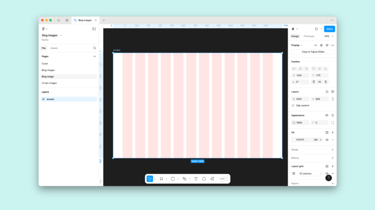
Create a new frame for your signup page. The frame size should match the device you’re designing for. For desktop, use a frame size of 1440×1024 pixels, or for mobile, go with 375×812 pixels (standard for iPhone).
Organize Layers:
Label your layers in a logical way (e.g., Header, Form, Button, Input Fields). This will help you navigate your design more efficiently as the project evolves.
Step 2: Add Background and Branding
Background Color:
Start by selecting your frame and applying a background color. You can use a solid color or a gradient to keep things visually appealing. The background should be simple and unobtrusive, complementing your brand’s aesthetic.
Logo:
Place your company’s logo at the top of the page, ideally centered or aligned to the left. This creates brand recognition and reinforces trust right from the start. You can import your logo directly into Figma using the Place Image tool.
Step 3: Design the Header Section
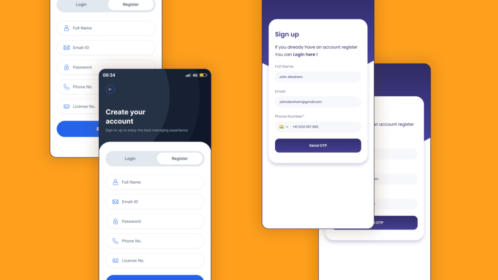
Title:
At the top of your page, add a clear, prominent title like “Create an Account” or “Sign Up.” This title should stand out, so use a large font size (32-40px) and bold styling to make it eye-catching.
Subheading:
Directly below the title, include a concise subheading like “Enter your details to get started.” This text should be smaller (16-18px) and should guide the user without competing with the main title.
Step 4: Create Input Fields
Name Fields:
Add two input fields for users to enter their First Name and Last Name. You can use the Rectangle Tool (R) in Figma to draw the fields, setting the width to 300-350px and the height to 40px.
For clarity, add placeholder text like “First Name” or “Last Name” inside each field. Ensure that each input has a label above or inside the field for context.
Email Address:
Next, add a field for users to enter their email address. Follow the same method as the name fields and use placeholder text like “Email Address.”
Password and Confirm Password:
Create two password fields – one for the password and one for confirming the password. To help users, you can include an eye icon that allows them to toggle password visibility. This is a small but helpful feature that enhances usability.
Spacing:
Ensure there is consistent spacing between the fields, typically 20-24px. This prevents the form from feeling cramped and improves readability.
Step 5: Add Checkbox for Terms and Conditions
Checkbox for Terms:
Add a checkbox below the input fields with text like “I agree to the Terms and Conditions.” This is an essential part of the signup process, ensuring legal compliance.
Link Text:
Make the text “Terms and Conditions” clickable, either by underlining it or using a different colour (typically blue). This will link to the full Terms and Conditions page.
Step 6: Add the Submit Button
Button Design:
Create the Submit Button for the user to complete the signup. Use the Rectangle Tool (R) to design the button, setting it to a size like 280x48px. Inside the button, place the text “Sign Up” in a bold, readable font.
Styling:
For the button color, use your brand’s primary color to make it stand out. Apply rounded corners (8px radius) to give it a modern, approachable look.
Hover Effect:
Consider adding a hover effect to your button. This can be a simple change in color or shade when the user hovers over it. It adds a layer of interactivity that can make the signup experience feel more dynamic.
Step 7: Add Social Media Signup Options (Optional)
Social Media Icons:
To make signing up even easier, include social media login options such as Google, Facebook, or Twitter. Below your primary signup button, add respective icons for each platform.
You can use Figma’s built-in icon library or upload your own icons. These should be clearly labeled, such as “Sign up with Google” or “Sign up with Facebook.”
Button Style:
Design these social login buttons to be consistent with the overall look and feel of your form. Ensure they have the same width, font size, and rounded corners.
Step 8: Add Footer and Additional Links
“Already Have an Account?” Link:
At the bottom of your page, add a text link for users who already have an account. The text could read, “Already have an account? Log in here.” This link should be styled with a smaller font size (14-16px) and a different color (e.g., light grey or blue) to make it distinguishable.
Privacy Policy Link:
Optionally, you can add a link to your Privacy Policy for legal compliance and user trust. Place this link in the footer, usually in smaller text.
Step 9: Prototype Interactions
Create Prototype:
Figma’s Prototype Mode allows you to add interactions between elements. Link the buttons to show how the form will behave when a user clicks on them, such as navigating to the next page or showing error messages.
You can also set up hover effects for the buttons to see how they’ll look in real-time. This step is essential to get a feel for how your design flows and to test user interactions.
Testing and Iterating
Once you’ve completed the design, it’s important to test it. Share the Figma file with your team or use Figma’s prototyping feature to test the user experience. Gather feedback from potential users and make any necessary adjustments to improve usability and flow. Testing is crucial because it helps you identify potential pain points and opportunities for improvement.