There are several key Login page designs trends and patterns that must be followed to fully unlock the potential for success in any SaaS product. By adhering to these best practices, you can create an experience that not only meets user expectations but also drives engagement and boosts retention.
From intuitive user interfaces and streamlined workflows to personalization and responsive design for login page designs, these elements work together to ensure your product is both functional and user-friendly. Staying aligned with these trends helps you create a seamless, enjoyable experience that resonates with users and maximizes the impact of your SaaS offering.
Table of Contents
Initial user onboarding is often the first and sometimes the only interaction many users will have with your product. This makes it essential to optimise the experience, ensuring it’s seamless, engaging, and tailored to guide users toward key actions.
Login page designs sets the tone for the user’s journey and plays a critical role in boosting conversions, reducing churn, and fostering long-term engagement. By making this initial experience as smooth and compelling as possible, you lay a strong foundation for user success and satisfaction.
What to Prepare Before Exploring Login Page Designs
Before you jump into designing a login page, taking some preparatory steps will set you up for success. Here’s how to make sure your login page is not only functional but also user-friendly and engaging:
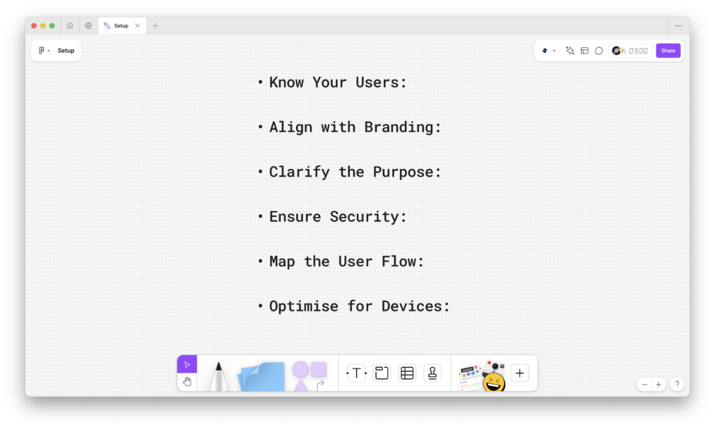
Know Your Users:
Understanding your audience is key! Consider their preferences, behaviours, and needs to create a login experience tailored to them.
Align with Branding:
A great login page should reflect your brand’s identity. Make sure the design complements your colour palette, typography, and overall branding.
Clarify the Purpose:
Knowing exactly what your login page designs should accomplish ensures your design stays focused. Whether it’s for a website, app, or service, a clear objective is essential.
Ensure Security:
Your users’ safety matters! By planning for essential security features like strong password requirements, two-factor authentication, and data encryption, you create a trustworthy environment.
Map the User Flow:
A smooth and simple login experience will delight your users. Define a clear user journey from login to recovery options, like “forgot password,” to keep things hassle-free.
Optimise for Devices:
A great login page works everywhere on
desktops, tablets, and smartphones. Make sure your design is responsive and looks great on all screen sizes.
By preparing with these key elements in mind, you’ll be able to create a secure, intuitive, and visually appealing login page designs that users will love.
How to design a login page?
Step 1: Start a New Project or Page
Kick off your design by creating a fresh project in Figma, or if you’re working on an existing one, just add a new page for the login screen. If you’re integrating it into a larger prototype, this is the perfect time to get everything aligned.
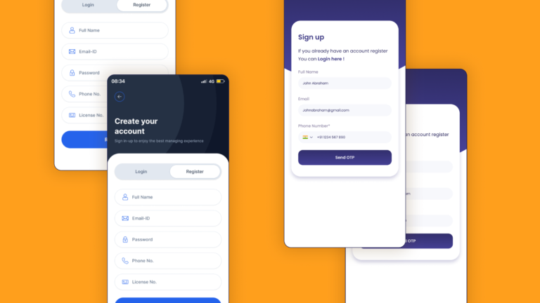
Step 2: Set Up the Login Form Layout
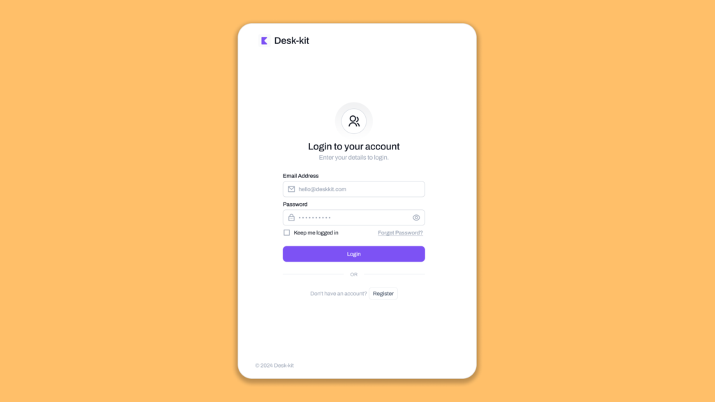
Add Text Fields
Begin by adding input fields for the username/email and password. Figma makes it easy to create clean, customizable text fields. Don’t forget to use placeholder text like “Enter your email” or “Password” to give users clear guidance.
Add Labels and Instructions
To make sure your design is both accessible and user-friendly, label each field appropriately. You can even add additional hints or instructions, such as password strength requirements or validation tips, to make the user experience seamless.
Step 3: Design the Action Buttons
Add a Login Button
Now, create a button that says “Login” — this is the heart of your page. Customize it to match your brand’s style, adjusting the size, colour, and overall design to make it bold and easy to find.
Add Secondary Actions
Consider adding secondary actions like “Forgot Password?” or “Sign Up” beneath the main button. Figma makes it simple to add text links or small secondary buttons, giving users quick access to important alternatives.
Step 4: Customize the Visual Design
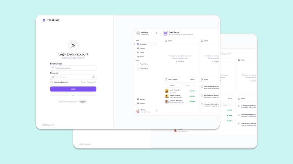
Apply Brand Colors and Fonts
It’s time to bring your login page to life with your brand’s unique colours and fonts. This helps maintain consistency across your design and reinforces your brand identity, making the login process feel more cohesive and professional.
Add Background and Logo
Next, place your brand’s logo at the top of the page this subtle touch goes a long way in building trust. For the background, keep it simple and minimal. Figma gives you plenty of options for creating clean, focused layouts, or you can add subtle imagery if that fits your design.
Step 5: Add Conditional Logic for Error States
Set Up Error Messages
In Figma, you can simulate error messages using interactive components. For instance, if a user forgets to fill out a field or enters incorrect credentials, you can show an error message that guides them to fix the issue.
Highlight Errors Visually
To make the error state even clearer, add visual cues, like red borders or icons, around the fields with mistakes. These little touches make the page more intuitive and help users quickly understand what needs fixing.
Step 6: Add Interactive Elements
Checkboxes for “Remember Me”
If you want to include a “Remember Me” option, Figma makes it easy to add a checkbox. You can place it right under the login fields and style it to match your overall design.
Password Visibility Toggle
Adding a password visibility toggle is a great way to improve user experience. Use Figma’s interactive features to add a little eye icon to the password field, allowing users to toggle between showing or hiding their password as they type.
Step 7: Add Security Features
Simulate Two-Factor Authentication (2FA)
If your login process involves two-factor authentication (2FA), create an additional screen or modal that asks for a verification code. Set up smooth navigation to display this screen after the user clicks “Login” — this helps simulate the real user flow.
Set Up Success or Error Pages
Design a success page that users will see after a successful login — a smooth transition to the main app or dashboard will leave users feeling confident. For failed login attempts, you can show an error state or route users to an error page to gently guide them through the next steps.
Step 8: Test Interactions and Usability
Now that your design is taking shape, use Figma’s prototype mode to test interactions. Click through your design to make sure everything works as it should — buttons should link to the right pages, and error states should appear when needed. Make sure the experience flows smoothly from start to finish.
Step 9: Conduct Usability Testing
Get real feedback by sharing your prototype with a few users for usability testing. Figma makes it easy to gather insights about user flows, error handling, and overall experience. Their feedback will help you refine the design and ensure it meets their expectations before you finalize it.
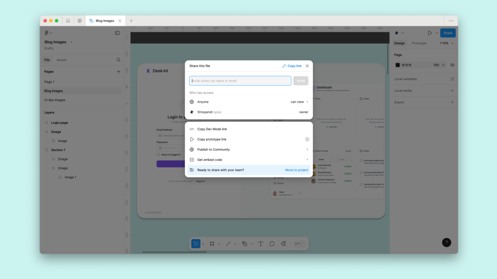
Step 10: Share with Stakeholders or Developers
Once you’ve polished your login page designs, share your Figma prototype with stakeholders or developers. Figma’s handoff tools make collaboration a breeze, allowing developers to view specs, measurements, and even style guides directly from the prototype. This ensures a smooth transition from design to development, saving everyone time and effort.
With these steps in Figma, you’re well on your way to creating a fantastic, user-friendly login page that looks great and works seamlessly.