In UI/UX design, creating clean, responsive, and structured interfaces is critical to success, and this is where a grid layout shines. Whether you’re designing for a large desktop screen, a medium-sized tablet, or a compact mobile phone, using a grid layout ensures your design elements are aligned, visually appealing, and user-friendly.
This guide explores everything you need to know about grid layouts, focusing on their importance in Figma for three popular screen sizes: desktop (1440px), tablet (720px), and mobile (360px). We’ll also discuss the risks of ignoring grid layouts, show how they can transform your workflow, and provide actionable tips to master them.
What is a Grid Layout?
A grid layout is a framework that divides a design into rows and columns to organize elements systematically. By creating consistent spacing, alignment, and proportions, a layout helps designers ensure that their work is easy to navigate and visually balanced.
In Figma, setting up a layout means configuring parameters like columns, gutters (spacing between columns), and margins (space around the edges). These settings make the foundation of any responsive design, allowing your layout to scale seamlessly across devices.
Why Grid Layouts Matter in UI/UX Design
It does more than just make your design look organized—it also directly impacts user experience, developer collaboration, and design scalability.
Key Benefits of Using a Grid Layout:
- Consistency Across Screens: A layout ensures uniformity in spacing and alignment, making designs look professional across desktop, tablet, and mobile devices.
- Improved Responsiveness: When scaling layouts for different screen sizes, grids provide a clear framework to guide adjustments.
- Enhanced User Experience: Aligning text, images, and buttons in a logical flow makes your interface intuitive and user-friendly.
- Aesthetic Balance: A grid layout introduces structure and symmetry, creating a polished, visually harmonious design.
Risks of Ignoring a Grid Layout
While some experimental projects may thrive without a layout, skipping grids often leads to more problems than benefits. Let’s break it down.
Downsides of Skipping a Grid Layout
- Inconsistency: Without a framework, spacing and alignment become random, making your design appear messy.
- Responsiveness Issues: Without a layout, adapting designs to different devices becomes tedious, often resulting in misaligned or poorly scaled elements.
- Frustrated Users: When design elements are poorly spaced or disorganized, users may feel confused or overwhelmed, leading to lower engagement.
When Not Using a Grid Layout Can Work
In rare cases—like artistic designs or creative branding projects—ignoring a grid layout might create a unique, unconventional aesthetic. However, for most UI/UX projects, a lack of structure can compromise functionality and scalability, making grids essential.
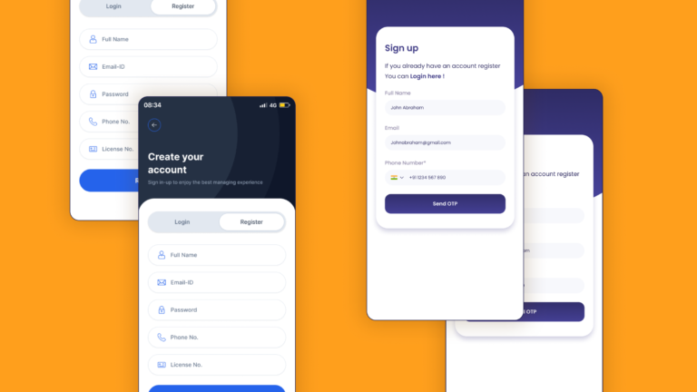
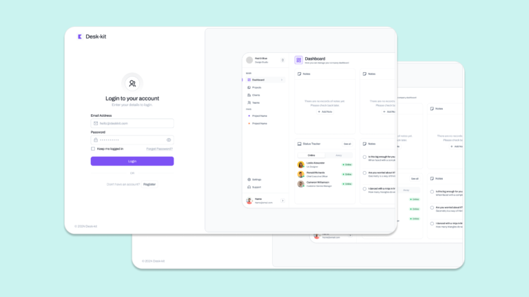
How to Create Grid Layouts in Figma for Desktop, Tablet, and Mobile
Figma is one of the most versatile tools for designing grid layouts. Its grid tools allow designers to create precise layouts tailored to different screen sizes. Let’s look at developing effective grid for the three primary device categories.
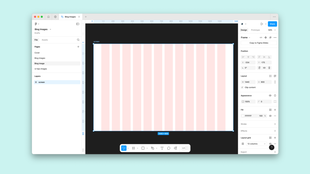
1. Grid Layout for Desktop (1440px)
Desktop layouts offer the largest canvas, making them ideal for rich, detailed content like dashboards, websites, or enterprise applications. A well-designed grid ensures that content remains structured and easy to navigate.
Settings for Desktop Grid Layout (1440px):
- Container Width: 1440px
- Columns: 12
- Gutter Width: 20px
- Column Width: ~96px
- Margins: 120px on both sides
Design Tips for Desktop Grid Layouts:
- Use a 12-column grid layout for flexibility. Designers can split columns into 2, 3, or 4 to structure content like images, text, or navigation.
- Centre the container for visual balance, especially on large monitors.
- Implement a baseline grid (typically 8px) for consistent vertical spacing across text and other components.
2. Grid Layout for Tablet (720px)
Tablets are a bridge between desktops and mobile devices, requiring designs that balance complexity with compactness. A responsive grid layout ensures content is still readable and functional.
Settings for Tablet Grid Layout (720px):
- Container Width: 720px
- Columns: 8
- Gutter Width: 16px
- Column Width: ~72px
- Margins: 16px on both sides
Design Tips for Tablet Grid Layouts:
- Use an 8-column grid layout to maintain flexibility while keeping the design clean.
- Align text and buttons to grid lines for improved touch accessibility.
- Stack secondary elements (like sidebar menus) vertically to optimize space usage.
3. Grid Layout for Mobile (360px)
Mobile designs prioritize simplicity and clarity. A grid layout helps streamline content to fit smaller screens without overwhelming the user.
Settings for Mobile Grid Layout (360px):
- Container Width: 360px
- Columns: 4
- Gutter Width: 16px
- Column Width: ~74px
- Margins: 16px on both sides
Design Tips for Mobile Grid Layouts:
- Stick to a 4-column grid layout to simplify navigation and ensure readability.
- Focus on core content and remove unnecessary elements to reduce visual clutter.
- Use Figma’s constraints to maintain alignment when scaling designs for different mobile resolutions.
How Grid Layouts Improve Workflow
A well-implemented grid layout doesn’t just improve the aesthetics of a design—it also enhances the entire design and development workflow.
1. Streamlined Collaboration
Designers and developers work more efficiently with a clear grid layout in place. Developers can easily translate designs into code when spacing, margins, and alignment are well-defined.
2. Faster Prototyping
With a grid layout, prototyping in Figma becomes faster and more precise. Grids guide element placement, reducing guesswork and enabling quicker iterations.
3. Scalable Designs
Scaling a design for multiple devices becomes seamless with a responsive grid layout. Designers can adapt layouts for desktop, tablet, and mobile without compromising alignment or spacing.
The Role of Grid Layouts in UI/UX Design
A grid layout is more than just a design tool—it’s a framework for delivering consistent, responsive, and visually appealing user interfaces. Whether you’re designing a feature-rich desktop application or a minimalist mobile experience, a grid layout ensures your design meets both aesthetic and functional goals.
By using Figma’s powerful grid tools, you can:
- Align content consistently across all screens.
- Create designs that scale seamlessly for various devices.
- Deliver polished, professional layouts that enhance user engagement.
Conclusion
A grid layout is the foundation of any successful UI design. It organizes your work, improves usability, and ensures your designs are responsive across desktop, tablet, and mobile devices. While ignoring a grid might occasionally lead to creative breakthroughs, the risks of inconsistency, poor responsiveness, and user frustration often outweigh the rewards.
Mastering the art of the grid layout will transform your designs, making them cleaner, more functional, and easier to scale. Start integrating grid layouts into your workflow today to create better designs faster and more effectively.